There was a time when the primary export of Canada’s ad industry was comedy. But more recently, our agencies have been making a significant mark with evocative work, and it’s never been quite as evident as this year. The most recognizable contenders for Cannes gold this year aim for an emotional reaction, and include rallying cries for the unsung and master classes in empathy.
But work that aims for the heartstrings has become the status quo for brands around the world, too. Emotional blockbusters such as States United to Prevent Gun Violence’s outstanding “Guns With History” stunt, and NoMore.org’s chilling domestic violence PSA that created a pause during the Super Bowl, will provide stiff competition.
Press aren’t allowed inside the jury rooms, but we do have access to those who have been there before and know what Lion juries will be looking at when assessing Canadian work.
“Better Tomorrows” (SickKids)
Agency | JWT
Competitions | Cannes Health, Film, Direct, Media, Film Craft
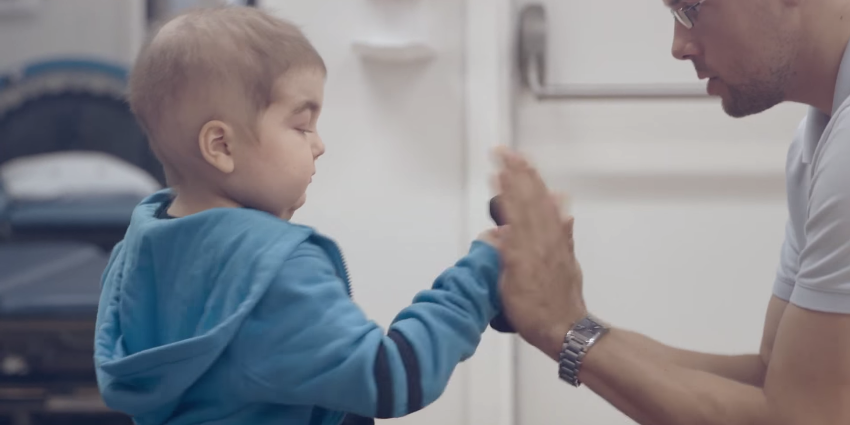
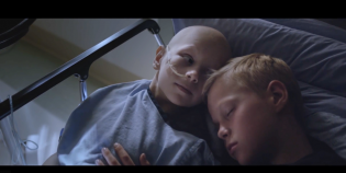
This campaign offered a heaping dose of perspective. Featuring 42 simple yet heartrending ads that aired over 42 days, the campaign reminded people of the real daily struggles faced by sick children and their families. As a fundraising campaign, it was a resounding success, driving $37 million in donations—more than the hospital has ever received in one month in its 42-year history.
The Jury View
Former Film juror Lance Martin, a parter at Union, admires the sheer ambition of this project, but says what really makes it stand out is its relatively broad approach. “So much pro bono work attempts to reduce issues down to a single moment that will resonate with audiences. This campaign has gone completely in the opposite direction, demonstrating the depth and complexity of the work Sick Kids does and giving its audience countless opportunities to form an emotional connection.”
Brenda McNeilly of Whatifmanship Copywriting and Creative, says that as a Direct Lions juror, she looked for work that was unexpected. She says of this year’s contenders, Better Tomorrows stands out as the most “Lion-worthy.”
“It’s simple, pure, powerful and visceral,” she says. “It does what’s increasingly difficult to do these days: breaks through the self-absorbed veneer of everyday life with an emotional wallop. This campaign proves that sometimes, in order to see the big picture, you have to think small. If this campaign doesn’t make you feel something, you’re a stone. If it doesn’t make you act, you’ve got some tough questions to ask yourself. If it doesn’t win a Lion, I’ll be shocked.”
“In Her Shoes” (CIBC)
Agency | Cundari
Competitions | Film, Film Craft
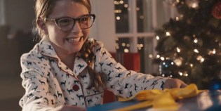
This spot offers a very visceral first-person view of a woman’s struggle with cancer, from diagnosis to treatment and including the agonizing looks of fear on her family’s faces as she fights the disease. All in support of the CIBC Run for the Cure fundraising event, this spot aims to connect viewers to those who ultimately benefit from cancer research.
The Jury View
“Had I seen this idea as a script, I would have loved the idea of literally putting you in the shoes of someone discovering they have breast cancer. But I would have been wary of being able to pull it off,” says Lara Palmer, creative director of Lara Palmer Advertising Creative and a former Design juror. “Well, they pulled it off and the result is a story that cuts straight to the emotional core and feels genuinely honest. Deserves a Lion.”
Union’s Martin believes this also has a strong chance in the Film Craft competition. “The film technique is fresh and well produced. It allows you to literally be in the woman’s shoes and experience the journey. Because there’s no dialogue, it is more likely to resonate with judges for whom English isn’t their first language, which gives it a better chance to connect with the entire judging room.”
“Kids Read Mean Tweets” (Canadian Safe School Network)
Agency | John St.
Competitions | Film, Branded Content
Riffing on Jimmy Kimmel’s late-night comedy bit “Celebrities Read Mean Tweets,” this spot reveals that hateful words are anything but benign. Rather than laughing at celebrities reading public criticism (doing so with a knowing wink and a nod), watching kids read what their peers say about them instantly illuminates just how damaging and cruel careless digital communication can be.
The Jury View
“This piece exposes the ugly truth to Jimmy Kimmel’s ‘Mean Tweets’ segments: that what he’s showing is cyber-bullying, even if it is targeted at celebrities,” offers Martin. “Taking that insight and bringing it into the real world of kids and teens makes for a powerful message.
“The risk here is how it will be perceived by judges who aren’t familiar with the cultural background. Without a familiarity with Kimmel, it’s possible that they’ll miss the added layer of commentary and perceive it as being too straightforward.”
“#LikeAGirl” (Always)
Agency | Leo Burnett
Competitions | Undetermined at press time
What does it mean to do something “like a girl?” The creative team at Leo Burnett asked this very loaded question on behalf of Always and the answer depended heavily on who was asked. Adult women and men perceived the term as a pejorative, while little girls had a completely refreshing take. With over 56 million YouTube views, this story of female empowerment has been seen around the world.
The Jury View
“This has obviously touched a chord about the lack of confidence in young women when they need to be reminded of it most,” says Palmer. “I’d say this is a safe bet to clinch us a Lion—most likely a Gold, possibly a Grand Prix. It’s incredible work for any category, but especially for the notoriously bad, feminine hygiene category.”
123w founder and creative director Rob Sweetman, who sat on the Promo & Activation jury, attributes this work’s medal potential to its ubiquity as well as its quality. “Because of the volume of work at Cannes, jury fatigue is a factor. So if the judges are familiar with a good piece of work, it gets an automatic pass to the shortlist. And from there anything’s possible, especially if there’s a champion of the work in the room.”
That said, Sweetman says brand linkage will be this spot’s greatest hurdle. “This is a lovely idea, extremely well executed. But it’s following a trend: feel-good content loosely tied to the product. I can already hear a juror in the back yell, ‘Anyone could have done this!’ But, because of its scale and success, I think the jury will see past this. “Always” stands a great shot at a medal.”
Former Promo & Activation juror Brian Sheppard, co-executive creative director at Saatchi & Saatchi, agrees that this spot has the chance to go far. “This will do very well in the judging rooms, and when it comes time to pick the golds, I expect that a lot of hands will be up for this one,” he says, anticipating that the discussion around it will likely be along the lines of ‘Sure wish I’d done that…’
“It’s a beautiful ad to be sure, but today that simply is not enough. This is a massive idea, based on a powerful insight,” adds Sheppard. “And it’s an idea that was expressed so perfectly and simply that it has quite rightly gone beyond just being a nice piece of advertising. It has lodged itself in our culture. In doing so, it has actually changed the way society thinks about how we talk about what it is to be a girl. I love this idea because it’s smart. I love this idea because it shows that big brands can still do big ideas. And I love this idea because I have three daughters, and this kind of work changes the way they see themselves, for the better.”
Justin Poulsen “Severed Thumb Drives”

Agency | Rethink
Competitions | Design, Direct
To promote the work of Justin Poulsen to potential clients, Rethink came up with a novel idea that was a cut above – or rather a cut off. Rather than just send around a USB drive, also known as a thumb drive, to his target audience, the agency came up with something more memorable: a USB drive embedded in a severed thumb. This work isn’t pulling heartstrings like other ads here, but may get an emotional response nevertheless.
The jury view
In terms of the design category, Barry Quinn, executive creative director of Juniper Park, offers more of a general commentary. He says that in his experience on the design jury, much of the conversation focused on what even constituted a design entry.
“There was a fair bit of debate on what a winning design entry actually is in a world where disciplines and business models are merging,” says Quinn. “It was very clear that a lot of agencies were just entering advertising into this category, and those entries were not well received. The jury is looking for work that is more than just well crafted; they want evidence of design thinking, design culture and a marriage of the idea and the execution. The idea can’t just be ported to the medium; it also has to have a symbiotic relationship with the medium.”
Martin says that these days, judges are looking for designs that incorporate technological innovation and utility, as well. “This is a great design entry because it does so much more then just showcase his photography. It’s playful, attention getting, and it puts proof of the photographer’s strength as a model builder directly into the hands of his potential clients.”
He offers one word of caution, however. “The term thumb drive is not a universal one, which could cause some international judges to pass it over without appreciating the full concept.”


