 In an effort to better communicate its focus, Montreal-based Exacto Communications has refreshed its brand with a re-designed site and logo.
The agency, which specializes in communications and PR, employs 18, and counts Reebok, Future Shop and CCM Hockey among its clients.
According to Exacto president Benoit Allaire, the site, which hadn’t changed in five years, was overdue for a overhaul. More importantly, he said, the old version represented a ”disconnect” between the Exacto of the past and what the agency has become.
“You look at your website and it’s like wearing the same clothes you wore five years ago, you say, ‘this is not who I am,” Allaire said. “We wanted something that really got to the essence of who we are without saying too many words, that’s easy to navigate, that would be fun to navigate…and you would basically get the agency.”
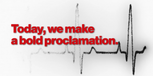
The site, which was designed internally, features a more modern, simple and streamlined look, and brings the agency’s philosophy of leadership, partnership and creativity to the forefront. It’s also designed to showcase the shop’s scope of services, which range from strategic planning to graphic design.
Exacto’s logo has also changed, in both font and colour. Red sans-serif type has been replaced with underlined bronze type. The new logo is meant to simplify, modernize and create cohesion, Allaire said.
“What we had before we felt was a bit complicated, and the bronze kind of came organically because when we re-did the paint job in the office, that’s one of the colours that got applied. It was kind of a natural fit, to bring that colour in.”
Exacto Communications was founded in 2005, and celebrates its 10-year anniversary in May.


