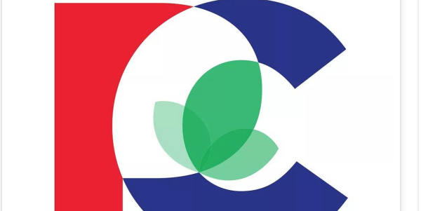
What’s blue and white . . . and red, and green, and criticized all over? The Ontario Progressive Conservative Party’s new logo, based on early feedback on social and in media coverage.
Officially unveiled over the weekend at an event featuring party leader Patrick Brown, the new logo is intended to convey “inclusion, renewal, openness and change” and was developed by Dan Robertson of Indent Communications. Robertson was also director of advertising for the federal Conservative Party of Canada when it won the general election in 2011. Besides the mixing of the traditional conservative blue with a more liberal red, the centre of the logo features a green leaf that had more than few observers making connections to the NDP.
As might be expected of a logo used by a political party, the reaction was swift and in some cases scathing, particularly from media who are less than enamoured with the Ontario PCs in the first place.
I don't understand how people can think the green in the new Ontario PC logo is pot. Oh, wait… #onpoli #cdnpoli pic.twitter.com/MKY4TbvW3X
— Stephen Lautens (@stephenlautens) March 5, 2016
One of the other big complaints about the logo was its complexity:
What is with this crazy new logo from the Ontario PC party? No human can draw that. Draw-ability is important for a logo.
— J.J. McCullough (@JJ_McCullough) March 5, 2016
Some even questioned the tactic of unveiling the logo at this point in the party’s history:
Here's a pro tip: if your plan to "revitalize your brand" begins with a new logo, you're doing it wrong. https://t.co/GVKdDBMuUR
— DennisVanStaalduinen (@DenVan) March 5, 2016
The Toronto Star decided to go directly to the experts by asking three different graphic designers on their reaction to the Ontario PC logo. This comment from Chris Lee was one of the best takes:
“The geometric construction of the logo is also consistent with current trends in graphic design that are already becoming cliché and outdated,” he explained. Lee said the rebrand is catching up with “the turn to flat design in iOS 7, Windows 8 and Google’s ‘Material Design.’ ”
If nothing else, the logo provides fodder for agencies who are already using it to prompt discussions with their own audiences on social media:
What do you think of the Ontario PC Party’s new logo? #OnPoli https://t.co/qmGuYVJgnl pic.twitter.com/mdcm97480f
— Armstrong Strategy (@ArmstrongStrat) March 7, 2016


So is Chris Lee saying the logo is designed by a computer/software without any human creativity?
Therein lies the problem. “This Buds for you”.
I feel so much better about the Tories now they have a new logo to match their personality. I guess their policies are irrelevant.
Tuesday, March 08 @ 8:00 am |