 Kelseys has revamped its look to attract the next generation of diners.
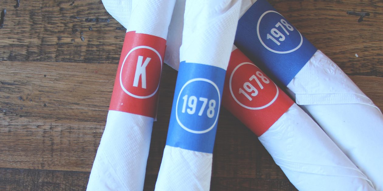
The 38-year-old roadhouse concept, owned by Cara Operations, tapped Toronto-based Open to develop the new brand identity. The agency redesigned numerous touchpoints including the logo, tray liners, french fry containers, napkin rings and staff uniforms.
The branding uses Kelseys original colours — red and blue – and is meant to be a mix of modernity and nostalgia.
“We used nostalgic cues because in our minds, a roadhouse [calls to mind] a whole bunch of good things from our past,” said Martin Beauvais, partner at Open. “It doesn’t matter if you’re 50 or 30 years old… It feels nostalgic with the original colours and old-school typefaces that we’ve seen many times, but then we’ve put them together and it creates a new aesthetic.”
The new brand identity is part of a larger refresh for Kelseys, as it seeks to attract a new generation of diners. “I think every brand is trying to figure out how to become more relevant with millennials,” said Grant Cobb, senior vice-president, casual dining division at Cara Operations.
 “That was part of our objective, but we’ve been around a long time, so we had to strike the balance between trying to develop a new look and feel and menu that attracted millennials, while not putting out all these great customers that have been loyal fans for a long time.”
The chain is renovating its 70+ locations in Canada, and 10 have been done to date. The exteriors are being painted white, while the insides will incorporate more wood and warmer colours. Each restaurant will also have a signature wall with images that reflect its local neighbourhood. For example, an Oakville, Ont. restaurant has images of Shell and Ford, two major employers in the area.
A revamped menu rolled out in October with 19 new items including “The All-Day Breakfast,” with bacon, cheese, lettuce and a sunny-side-up egg; and “Roadie’s Fave Fried Pickles.”
Open designed a set of icons for each of the core menu’s main offerings including burgers, chicken and salads, with headings like “share the love” and “chicken out.”
“The menu really calls out each one of those pillars, and draws attention to them in a very easy way for the guest to understand,” said Cobb.


