Ontarians who’ve been to a new Liquor Control Board of Ontario (LCBO) retail store or seen one of its newspaper inserts lately have probably spotted the brand’s new logo – part of its recent rebrand and new brand vision, “Let’s Get Together.”
The brand refresh rolled out rather quietly — the new logo made its public debut in May, appearing in the LCBO’s newspaper insert and some in-store collateral — in part because the company wasn’t out to make a dramatic overhaul to its brand and stores all at once. “We’re a government agency and don’t have the budget to do that, so it’s not a big, splashy launch like some retailers might do,” said Kerri Dawson, vice-president of marketing at the LCBO.
The LCBO’s former brand vision – “Discover the World” — served it well for the last 10 years, said Dawson, but customer research showed it was time to evolve to something more engaging.
When the LCBO signed Leo Burnett as its AOR in late 2012, Dawson said it was with the express purpose of having the agency help it refine where the LCBO was headed with the “Let’s Get Together” brand vision, as well as create elements such as a new logo, crest, typefaces and colour palette.
Consumer feedback included positive associations with the brand, including references to it being “efficient” and “socially responsible,” but consumers also felt the LCBO could become more social and interact with them in a casual way, said Dawson.
The LCBO’s new corporate logo has a more simplified look; gone is the grapevine in the background. “It was time to make it more clean and defined and contemporary,” she said. There are also new letterforms, including a loop in the ‘b.’ Dawson sees the new logo as more approachable, fun and casual.
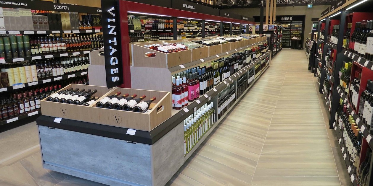
The retailer’s new location in Toronto’s Beaches neighbourhood opened last month with both the new logo out front and a revamped store design within. Dawson said the modern feel of this “urban infill” store — complete with funky fixtures and colours different from those used in other stores — comes from understanding that urban customers want more than just convenience when shopping at the LCBO.
“They also want a nice selection of higher-end product and they want an experience when they come in the store; they want a bit of ‘retail theatre’ when they shop with us,” she said. For that reason, the new store emphasizes Vintages – the LCBO’s fine wine and premium spirits business division (which Leo Burnett is currently working to rebrand).
The Beaches store was designed by the LCBO’s internal store design group in conjunction with II by IV Design.
To complement the LCBO’s new brand vision, the company launched its new website in late June. The redesigned site (built by Nurun) includes a lot more content than it did before, including recipes and pairing suggestions. “It’s the kind of site customers will want to dive in and spend some time reading,” said Dawson.
Two new videos, both produced by Leo Burnett, are also housed on the site. One features a group of friends as they prepare for and gather at a dinner (that includes enjoying LCBO products, naturally). “We wanted to represent the new brand vision in a beautiful way,” said Dawson. There are no plans to format the video into a TV spot, she added.
In addition to the brand video is one called “Beau’s” featuring the co-founder of family-run Beau’s All Natural Brewing Co. talking about everything from the craft beer company’s brewing process to its support of charities and his personal background.
While the LCBO is out to appeal to a very broad customer set—Ontarians—the “Beau’s” video will most likely resonate with a segment the LCBO calls “adventurers.” Dawson said the LCBO doesn’t define this group by age, but rather by its behaviour. These are the customers keen to learn the stories behind LCBO products and the people that produce them. She also believes “adventurers” will appreciate the additional content on the new website.
“They’re interested in understanding how to match food and beverage alcohol,” said Dawson.


