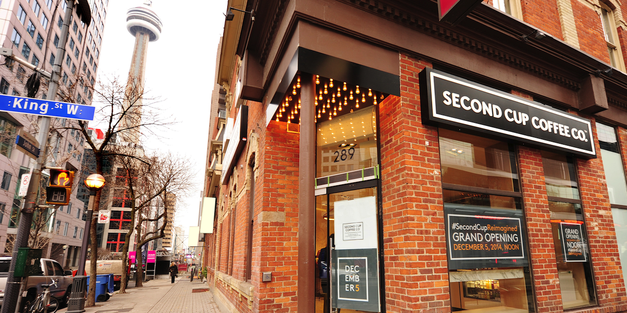
When the Second Cup rebranding debuted, I welcomed its bold new logo. In a vertical as ferociously competitive as coffee—where a company like Second Cup competes against retail titans like Starbucks, Tim Horton’s and McDonalds—it’s always encouraging to see a homegrown brand demonstrate vitality and sophistication with a nice reboot.
Jacknife design, a local agency on the rise, did a good job with the Second Cup identity, replacing a badly dated and hokey logo with a modern mark. Then came word of Second Cup’s “café of the future,” a redesign of their stores that promised to bring a new level of elegance and technology to their equally dated retail environments. All of this suggested to me that the organization was finally stepping up its game and was ready and willing to compete against both the big boys and the hipster coffee joints proliferating across town.
But something appears to have gone amiss.
I visited a handful of Second Cup locations in December—on major streets in Toronto like Yonge, Queen and Eglinton—and was struck by how poorly they’ve handled their rebranding. Several of the stores I visited featured outdated signage and inside, the new and old logos literally sit side-by-side. The redesign of their stores, it appears, will be incremental and in the meantime, an unfortunate mess.
Before I cast more slings and arrows, let me offer this disclaimer: I was not involved in this work or privy to any of the details, nor (in fairness) did I speak to Second Cup, the agency or the interior design firm involved. It’s far easier to critique a re-branding than to execute one. My intent here is not to indict companies who I admire and root for, but to extrapolate best practices for others considering a re-branding.
Having said that, I believe that the piecemeal roll-out of the new Second Cup brand is a mistake and offers marketers considering this incremental strategy a valuable lesson on how *not* to handle rebranding initiatives.
When organizations take on a re-branding, they need to identify the total cost of their brand work so they don’t end up half-pregnant in the market. Nothing looks cheaper or more disorganized than having your old logo next to your new one. It’s like asking your current partner and an ex to pose in the same photo together (i.e. a bad idea).
Second Cup should have accounted for all of their touch points, starting (not ending) with their retail environments. We’re not talking about an ecommerce company, after all. Their coffeehouses de facto define their brand, so their new store experience should have been the launch pacing item, not the start of a pilot project.
In the ideal world, Second Cup’s signage, uniforms, menu, merchandise, fleet as well as their marketing communication mix all needed to be refreshed simultaneously, or at least, during a short launch window. An integrated and properly coordinated launch would have created excitement, drama and momentum in the marketplace.
Instead, they look like they’re languishing, which opens up the door for all kinds of gruesome speculation. Is Second Cup too poor or too cheap to pay for a proper rebranding? Do the franchise owners hate the new logo? Were the franchisees asked to pay for the redesign of their stores and that’s why nothing is happening at the old locations? Or was this all just a simple tactical misstep on the part of Second Cup’s marketers and operations folks?
To Second Cup, I say—you need to fix this, fast. Every day you’re in-market with two logos and dreary old stores is another day you’re eroding your brand and helping Starbucks. If the franchise owners can’t or won’t do it, then you need to find the money to solve this problem. You have outstanding locations, a competitive product, a new logo and a fantastic new store design – so for the love of your brand and your business, hurry up and finish what you started.
Canadians often lament how our businesses fail to compete against multinational companies with monstrous marketing budgets, but the truth is that smart brand stewardship doesn’t cost much. I just hope that Second Cup fixes their mess and then continues to invest in improving their marketing and customer experience, which will ultimately serve them very well. If nothing else, I value having a local alternative to Starbucks and would love to see them succeed.
So what can we take away from this story? Even with a great agency, a great client, a great design firm and a great market opportunity, things can still go sideways. It’s essential then to ensure that you anticipate and account for the total cost of a re-brand. Make sure your launch is paced properly and delivers on the new promise where it matters most. If you’re not ready to do all of that, then you’re probably just not ready.
Mike Torre is a Toronto-based freelance marketing strategist and creative writer
This article originally appeared at LinkedIn.com.


