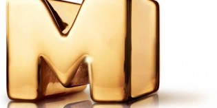
The ROM’s new look is equal parts education and enticement
If all goes according to the Royal Ontario Museum’s meticulous, years-in-the-making plan, its new logo – to be officially unveiled Tuesday – will serve as a constant reminder that the ROM is “not just dinosaurs.”
 As historically important and educational as dinosaur exhibits may be, said Kelvin Browne, vice-president of communication at the downtown Toronto museum, they’re not necessarily what comes to mind when one sets out to find contemporary, exploratory art and artifacts in the city. In fact, the ROM’s commitment to preserving the past may have earned it a less-than-enthralling reputation.
“Our brand research said two things unequivocally,” said Browne. “One was huge recognition for the ROM but ‘I don’t really know what you do.’ The second was ‘whatever it is you do, I bet it doesn’t change very much.’”
 The museum’s research also found that the ROM was recognized more for its exterior crystal building design than the collections it boasted inside.
To revitalize, the ROM sought the expertise of New York-based marketing and design firm LaPlaca Cohen, which specializes in arts institutions and has previously reinvigorated the brands of world renowned spaces such as New York’s Metropolitan Museum of Art and American Museum of Natural History and the J. Paul Getty Museum in Los Angeles.
Arthur Cohen, the firm’s chief executive officer, said he wanted to make the brand more fun, so people would view the ROM as a place to visit repeatedly in their leisure-time. “The idea was creating something and presenting it in such a way that people move from passive to active in their consideration [of the ROM],” he said. “It’s not just good design, but design in service to a really important idea.”
Browne added that the museum needed to consider what it could grow into, rather than what it had traditionally been.
The ROM’s versatile new logo attempts to embody that philosophy. Framed by robust capital ‘R’ and ‘M’ letters, the ‘O’ in the logo serves as a lens in which diverse images will be interchangeably displayed based on the museum’s offerings. The logo can also be adapted to suit different audience segments, and is flexible enough to be meaningful to varying demographics. (For a children’s exhibit, the ‘O’ would contain a child-friendly image, while a dinosaur exhibit might instead contain a Stegosaurus in the same spot.)
“I’ve always believed that the ROM is both serious and popular,” said Browne. “Without making us any less serious, this new visual identity says you can have some fun. You can come here and enjoy yourself while you’re learning something.” He noted that there would also be more programming and promotion of the museum’s permanent galleries.


