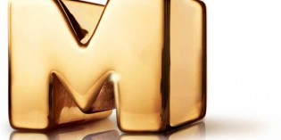
 Animation channel Teletoon has spruced up its brand identity for the fall season with the introduction of a new logo.
The redesigned brand identity applies to Teletoon’s daytime properties in English and French. The branding for the Teletoon’s evening programming and its Teletoon Retro channel is unchanged.
The logo design, developed in-house, retains its previous yellow colouring but, according to Russell Ward, vice-president of marketing for Teletoon, allows for greater flexibility in terms of the way it can be shaped and presented using different materials and platforms.
Ward also said the update better reflects the station’s tagline, “Teletoon: It’s Unreal” and a brand philosophy that emphasizes infinite possibilities.
“The irony of having a brand idea that is limitless but having a whole bunch of rules about what we could and couldn’t do with the logo was something we wanted to address,” said Ward. “We wanted to take the handcuffs off and have our on-air and online identity reflect the idea.
“Now, we can do anything with the logo. We can morph it. It can be different shapes and textures. It’s now not just a piece of identity, it’s a living, breathing execution of the ‘unreal’ idea.”
The new brand identity went live earlier this week and is visible on television as well as the Teletoon website.
Teletoon is jointly owned by Astral and Corus Entertainment, with each media company holding a 50% stake.


