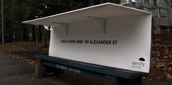
For some, a bus shelter is a bed.
That’s the simple, yet effective message a Vancouver homeless organization conveyed through an innovative marketing campaign that’s garnered worldwide attention.
Created by Spring Advertising for Raincity, the campaign uses park benches with a double-pronged effect – highlighting homelessness to the general public, and taking the non-profit’s message right to the very people who use the services.
One version saw benches fold out like “airplane tray tables” to create shelter for someone without a home to sleep. Another version of the benches read, “This is a bench.” At night, the light-sensitive ink changed the message to: “This is a bedroom.” Users were encouraged to seek more permanent shelter through Raincity.
Rob Schlyecher, creative director at Spring, said as an ad agency, they do not presume to be able to fix homelessness, but the campaign got right to people on the street.
“We can only try to act as a conduit between those who actually can help and those who need it,” he said.
“To that end, we wanted the users to see that Raincity was there for them on an immediate basis but also, through messaging and an address on the inside of the shelters, as a place to go for real help.”
Schlyecher said there was anecdotal reports of homeless people actually using the shelters while the campaign ran. Though the campaign ran last fall it’s garnered international attention recently as an antidote to spikes that were placed in doorways in London to keep homeless people away.
Media in the U.K., U.S., Chile, France, Mexico City picked up the story, though some didn’t realize the benches were in place as a short-term ad campaign.


