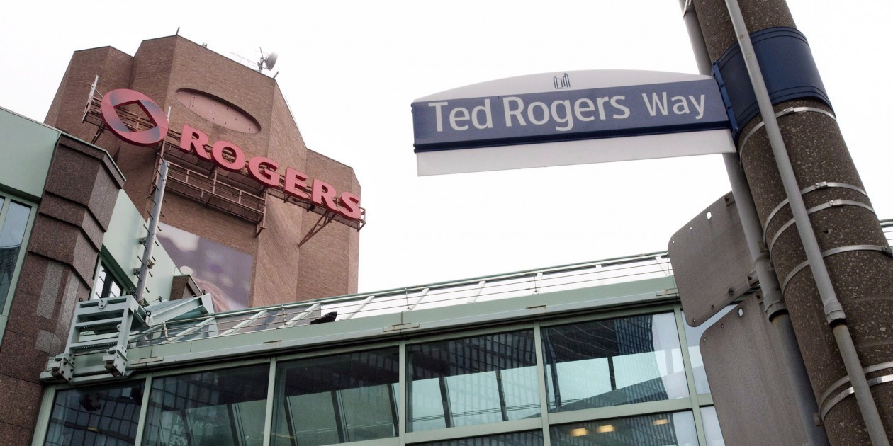

Rogers’ new brand identity.
Rogers Communications has unveiled a new brand identity that on the surface includes refinements to its logo and colour scheme, but is more fundamentally designed to convey the message that it cares about its customers.
Chief brand officer Dale Hooper characterized it as the company’s most significant rebrand in almost 14 years, and the largest he’s been involved with in a career that previously included a stint with packaged goods giant PepsiCo Beverages Canada.
Hooper likened the update to the global re-launch of a major consumer brand in terms of its scope and ambition. He described it as a continuation of the “One Rogers” approach first embodied by the rollout of its NHL coverage.
In development for approximately eight months, the rebrand is the latest iteration of the “Rogers 3.0” model championed by CEO Guy Laurence, who Hooper said took an active role in the rebrand process.
“[Laurence] is at heart someone who cares about the customer experience, brand and employee development,” said Hooper. “He was very involved in ensuring that our flagship brand was aligned throughout the organization. The consumer brand of Rogers is the biggest component of the corporate brand.”
The Rogers brand team, working with Publicis and Lippincott – a U.S. branding firm that counts Time Warner, Comcast and NBC among its clients – developed the new brand identity.
Hints of the company’s new look and tone-of-voice were first suggested in a TV commercial highlighting milestones in company history – such as the introduction of its cellular and cable services – that began airing in the fall.
“That was basically a nod to our customers that we’re proud of our legacy, we’ve made some mistakes along the way, but we’re excited for the future,” said Hooper, noting that the October launch of NHL hockey and last year’s “Roam like home” services were the first iterations of the customer-centric approach espoused by Laurence.
Some elements of the previous Rogers brand, most notably the mnemonic that accompanied all of its TV and radio commercials, have been retired, said Hooper. The red that figures so prominently in the brand has also been tweaked to match that of the Canadian flag (Pantone 485 C), while secondary colours like aqua and yellow have been added to its colour palette.
The logo that accompanies the Rogers nameplate – which is known internally as the “mobius” – has also been tweaked to make it feel more contemporary, said Hooper.
“One of the key things we need to do as a company is ensure that we make brand building and management a key capability, and we need to ensure our brands are clearly articulated and differentiated in the market,” he said.
“We continue to be amazed by how we find logos everywhere,” added Livia Zufferli, senior vice-president, Rogers Brand. “It’s a complex ecosystem for sure. When you’re trying to execute on such a grand scale you really get a great sense for how large and how many facets there are to the organization.”
Zufferli, who joined Rogers from Target Canada in November, said changing Canadians’ perception of the company, particularly in a category that is largely perceived as impersonal, will be an ongoing process.
“No brand is built overnight, so our intent and our desire is to really be able to connect with our customer in a more human way,” she said. “It is going to be journey, and as we continue to have more opportunities to interact with customers with this refreshed brand and our commitment to an enhanced customer experience, this will all build; our goal is to earn the trust of Canadians and have them understand where we’re evolving to.”
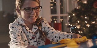
The company’s new brand identity is reflected in two consumer campaigns launching today, one for its newly minted Rogers Ignite home internet product, as well as a local-market campaign promoting its extended market coverage for cellular customers that features out-of-home, digital and radio ads.
Future campaigns, one addressing the expansion of its smart home monitoring service in Western Canada, will incorporate the new look and feel, which it will also permeate its retail business and other consumer touch-points.
“Increasingly this brand will be more pervasive in the marketplace,” said Zufferli.
She said while Rogers, which owns Marketing, would maintain its core values of being innovative and pioneering, it is entering a “new chapter” that gives it a more contemporary look and feel, and will employ a more conversational – and optimistic – tone in its advertising.
“At times in the past we might have had a voice that could have been potentially a little promotional or aggressive in nature, so we’re really looking at making this a customer benefit-led communications style,” said Zufferli.